
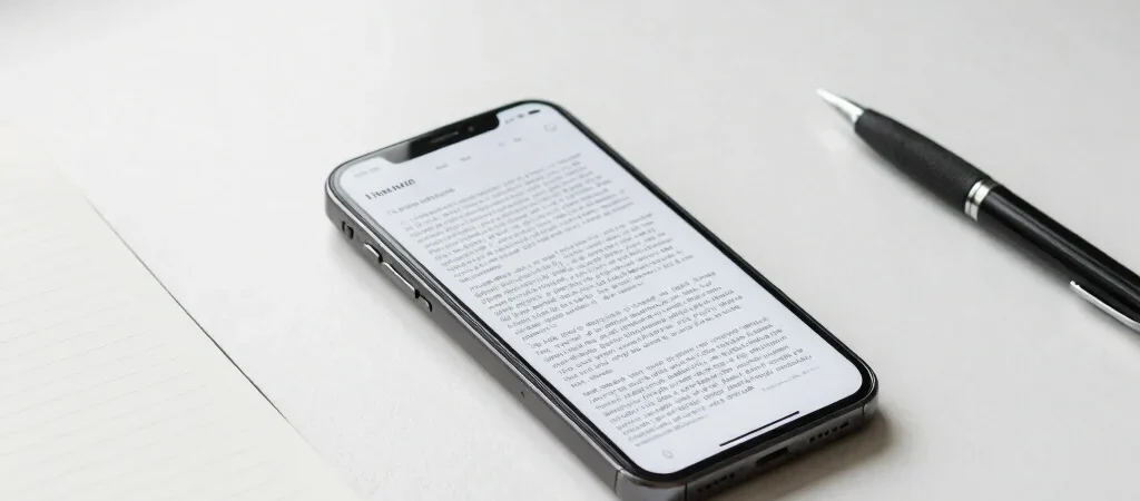
You open an article on your phone, find the first paragraph, and immediately lose your place to a tall block between the headline and the story. That interruption may be technically visible, but it makes the page harder to use. A better ad layout begins by protecting the reader’s path through the article.
Protect the opening
The headline, a useful opening, and the first section should establish what the article offers before advertising competes for attention. On a narrow screen, even a single large unit can push the answer far below the fold. Review the page on a real phone, not only in a desktop preview.
Give interruptions room
When ads appear within an article, place them at natural pauses rather than splitting a sentence, a short paragraph, or a heading from the text that follows. Keep enough visual separation that readers can tell where the editorial content ends and the ad begins. The goal is not to disguise advertising; it is to make the page understandable.
Check the whole experience
A layout that looks restrained on a laptop can feel crowded on a phone once ads, navigation, and consent notices share the same small screen. Test a few representative articles from top to bottom, including pages with longer headlines and images. If readers have to hunt for the next paragraph, simplify the layout before adding another placement.
Treat every ad position as a decision about attention. A quieter page is not an empty page: it is one where editorial content stays easy to find and advertising has a clear, contained place.